Responsive Web Design
Agenda
Introduction
Foundation of RWD
Retrospective
Introduction
What is RWD?1/4
Responsive Web Design is a methodology which advocates one HTML file should be able to adapt to different screen size.
What is RWD?2/4
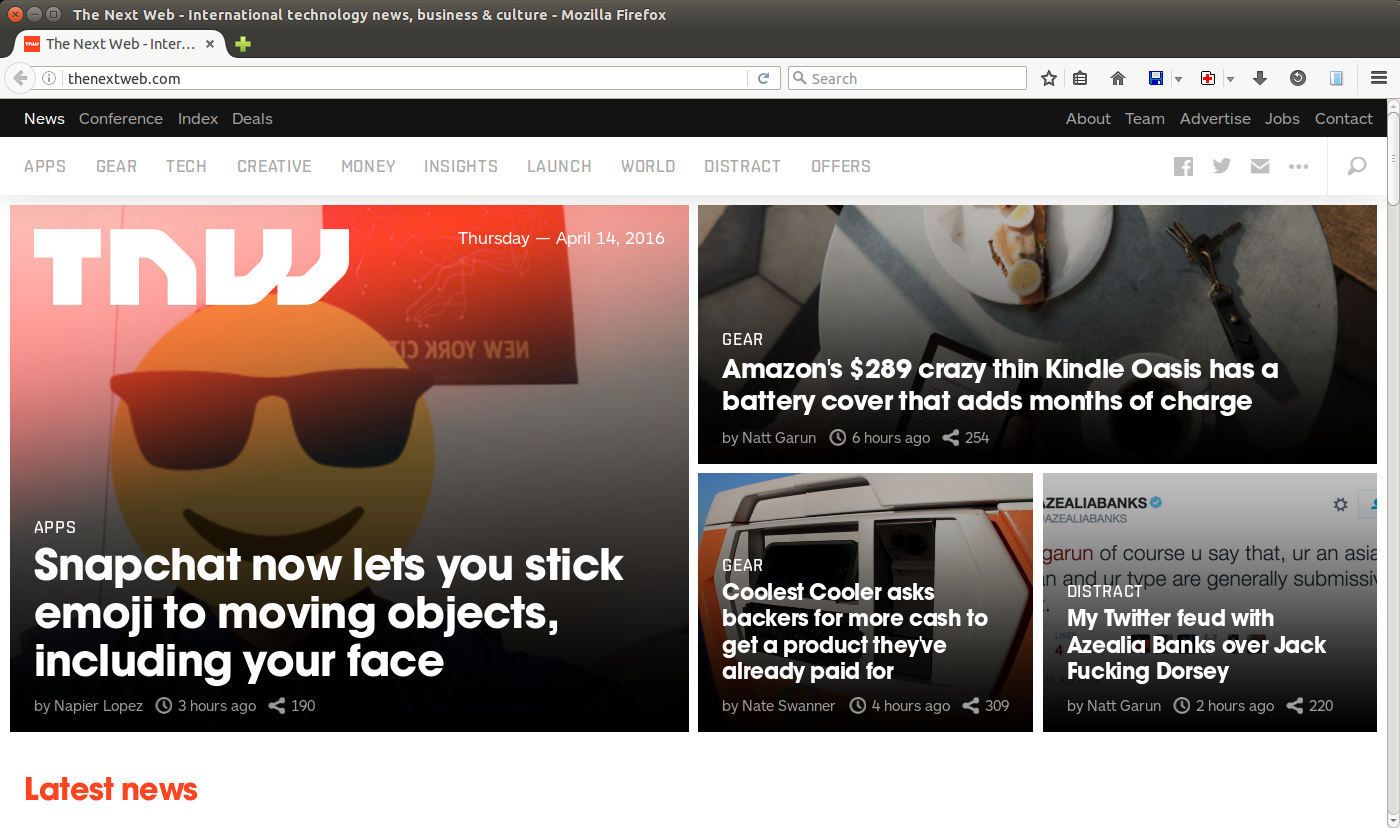
The Next Web screenshot with 1400x800 resolution
What is RWD?3/4
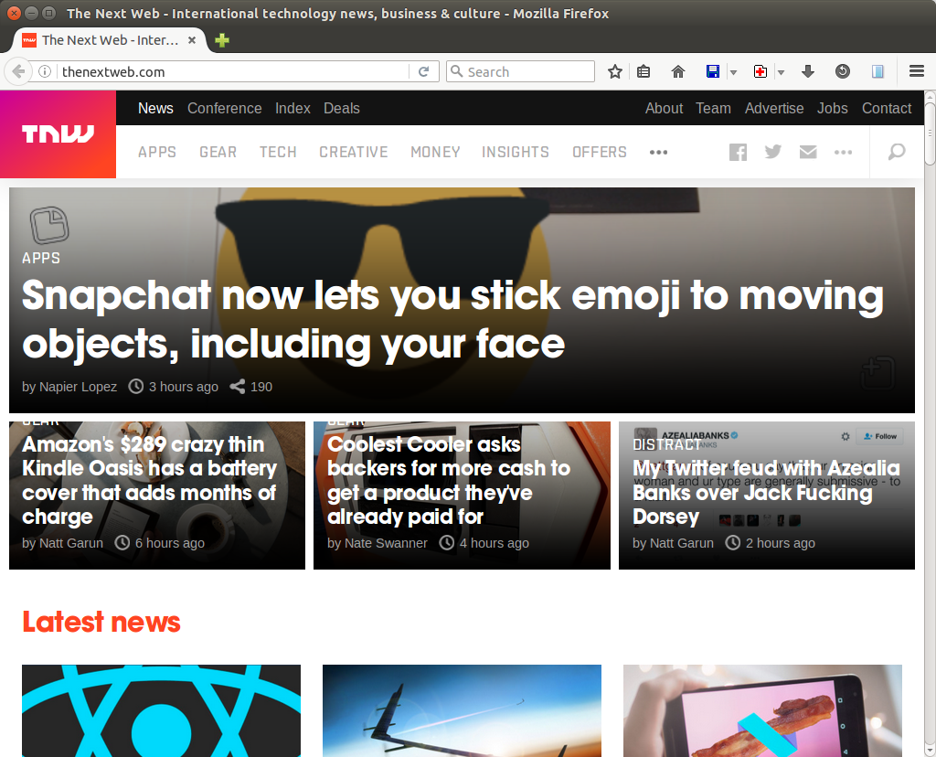
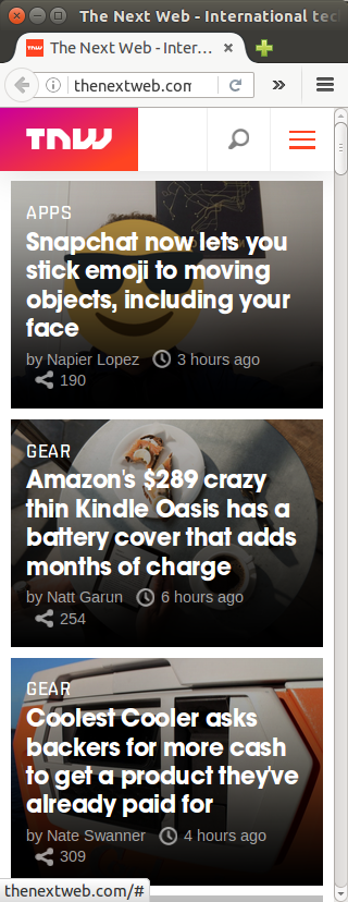
The Next Web screenshot with 1024px and 320px width
What is RWD?4/4

Motivation
Too many screen resolutions — width, height, and dpi
Difficult to determine screen size from user agent
Foundation of RWD
View Port1/2
Viewport is a rectangular area that is being viewed.
On mobile devices, the default width is usually larger than the actual screen size.
To build a mobile-friendly website, we should explicitly
specify width=device-width.
<meta name="viewport"
      content="width=device-width, initial-scale=1.0" />
View Port2/2
| Name | Description | Value |
|---|---|---|
| width | Viewport width | Integer in pixels or device-width |
| minimum-scale | Minimum possible zoom scale | Floating point between 0.0 — 10.0 |
| maximum-scale | Maximum possible zoom scale | Floating point between 0.0 — 10.0 |
| initial-scale | Initial scale when the page is loaded | Floating point between minimum-scale and maximum-scale |
| user-scalable | Can user zoom in/out? | yes or no |
CSS Media Query
@media only screen and (max-width: 500px) {
  /* Applies when width is less than or equal to 500px. */
}

@media only screen and (min-width: 500px) {
  /* Applies when width is greater than or equal to 500px. */
}
CSS Media Query Details 1/3
@media only screen and (min-width: 500px)
                   and (max-width: 1200px) {
  /* Applies when width is in 500-1200px. */
}
keyword only — No special effect on new
browsers. Old browsers will completely ignore the media query
directive.
media type —
all,
screen, and
print
CSS Media Query Details 2/3
@media only screen and (min-width: 500px)
                   and (max-width: 1200px) {
  /* Rules for screens with 500-1200px viewport width. */
}
Media Features
prefix — min,
max
viewport — width,
height, aspect-ratio
device — device-width,
device-height,
device-aspect-ratio
CSS Media Query Details 3/3
p { color: blue; }

@media only screen and (max-width: 768px) {
  p { text-decoration: underline; }
}

@media only screen and (max-width: 320px) {
  p { background-color: yellow; }
}
768px < width |
hello | |
320 < width <=768px |
hello | |
width <=320px |
hello |
Grid and Fluid
Use percentage instead of absolute measure units
Use grids to organize the content

Mobile First
/* CSS rules for mobile comes first. */

@media only screen and (min-width: 321px) {
  /* CSS rules for tablet or larger devices. */
}

@media only screen and (min-width: 1024px) {
  /* CSS rules for desktop. */
}
Reason: Some assets for desktop require a lot of network bandwidth, which is undesired for mobile. Thus, it will be preferred to give priority to mobile.
Range Overlap 1/2
.medium-only { display: none; }
.large-only { display: none; }

@media only screen and (min-width: 320px) {
  .medium-only { display: inline; }
}

@media only screen and (min-width: 500px) {
  .medium-only { display: none; }  /* reset */
  .large-only { display: inline; }
}
This style sheet resets the CSS property when the screen size is larger than the desired width.
Range Overlap 2/2
.medium-only { display: none; }
.large-only { display: none; }

@media only screen and (min-width: 320px) and (max-width: 499px) {
  .medium-only { display: inline; }
}

@media only screen and (max-width: 500px) {
  .large-only { display: inline; }
}
Off-by-one is necessary, otherwise both will be available on 500px.
This style sheet uses exclusive media query, but this might fail when the screen size is between 499px and 500px.
Image and Picture
<img> tag with srcset and
sizes attributes
<picture> tag with <source>
tags and a fallback <img> tag
<img>, srcset, and sizes
<img alt="placeholder"
     src="small.png"
     srcset="large.png 1200w, medium.png 500w, small.png 320w"
     sizes="(min-width: 800px) 40vw, 100vw" />
srcset — specifies
3 images large.png,
medium.png, and small.png for screen that
are larger than 1200px, 500px, and 320px respectively.
size — specifies 2 sizes. If the screen size is larger than or equal to 800px, then resize image to 40% of the screen size. Otherwise, fit the image to the screen.
<picture> and <source>
<picture>
  <source media="(min-width: 800px)"
    srcset="large.jpg 1024w, medium.jpg 500w, small.jpg 320w"
    sizes="(min-width: 1200px) 30vw, 40vw" />
  <source srcset="cropped-large.jpg 2x, cropped-small.jpg 1x" />
  <img src="small.jpg" alt="placeholder" />
</picture>
Remarks. <source> can refers to non-equivalent
images (i.e. browsers might not be able to derive one from the other
with resizing algorithms.)
Retrospective
IE Support
IE 6-8 does not have CSS media query support.
An severe issue on mobile first website.
There is a shim layer named Respond.js written in Javascript.
Guideline: Degrade the QoS gracefully even with mobile-based CSS.
One Size Don't Fit All
RWD is suboptimal because the users have to download some unused content/asset. However, properly crafted site can mitigate the overhead.
RWD is not the answer to every questions. A good design should be designed. A good mobile website requires not only a responsive layout but also well-studied mobile use cases.
Conclusion
RWD is a technique for web pages to adjust itself on different screen sizes.
Use CSS media query to support different screen sizes.
Use
srcset,sizes, or evenpictureto load different source images.RWD is the trend but mobile use case analyses are still required.
THE END
Q & A